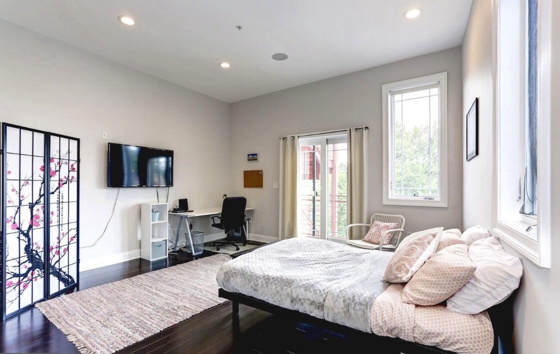
This home was a product of two homes merging. My clients moved in together and wanted to figure out how to merge their styles but also bring a fresh perspective.
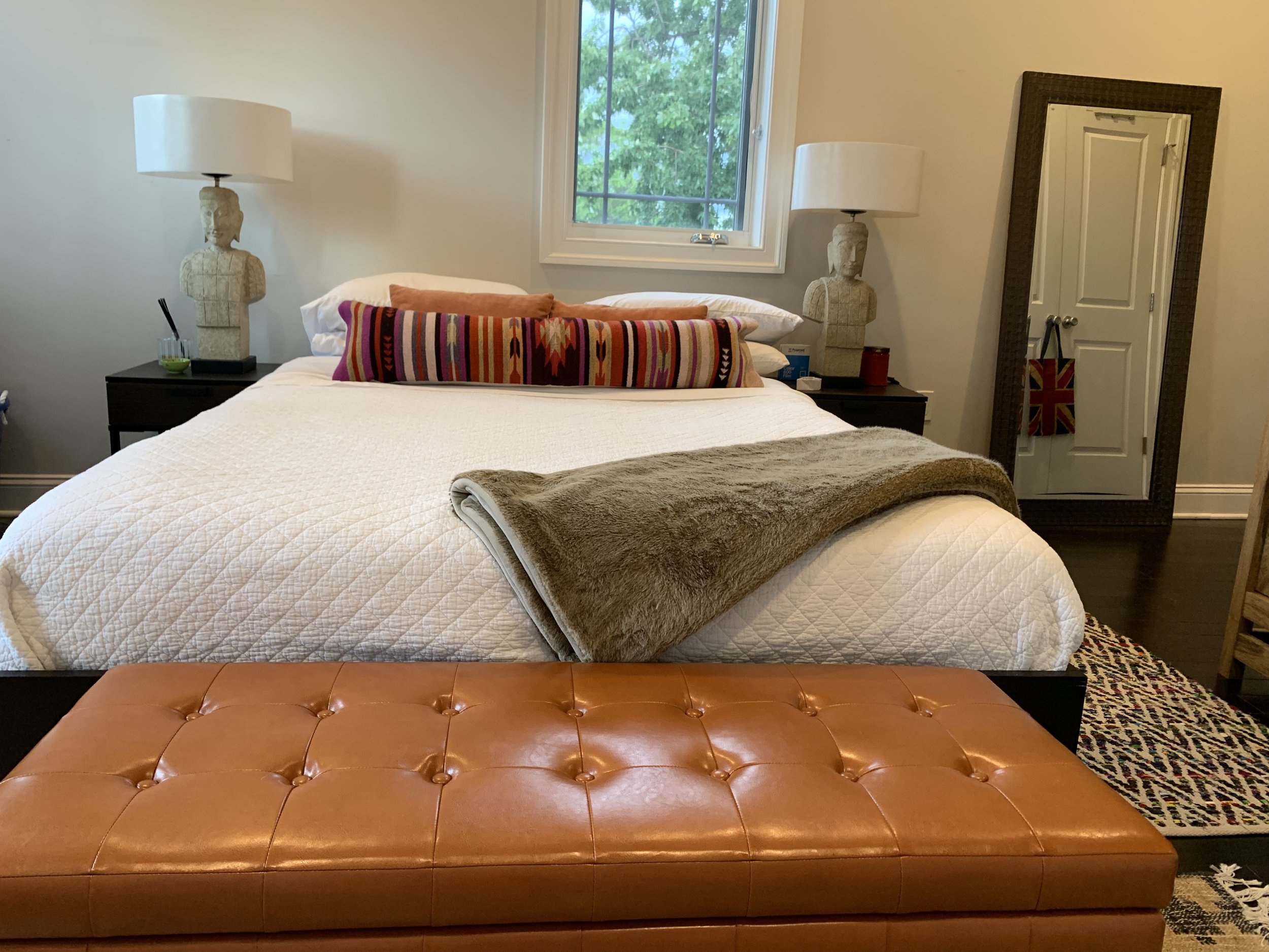
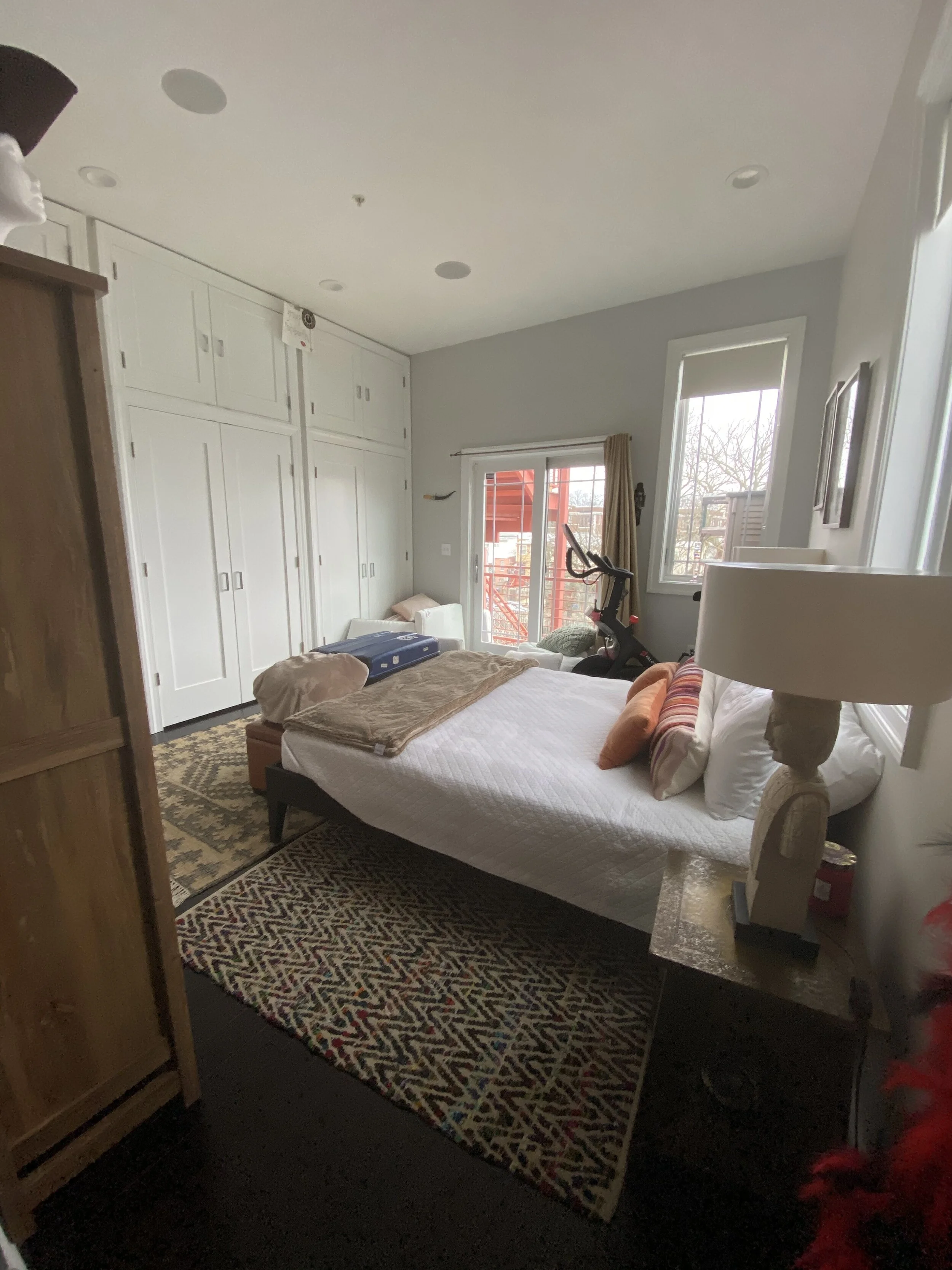
They have a rock and roll life and style and really needed storage as both of them have amazing clothes and love a good costume. We took the guest bedroom and added an entire wall of closets. This home has soaring ceilings and we took the custom cabinets all the way up. This allowed them ample clothing (and shoe) storage down below, while allowing storage for things they don’t need daily to go up top. They had some great pieces from his travels abroad and I wanted to make sure to use them. So the homeowner and I approached the guest room from an eclectic/boho/worldy perspective for the decorating with a caramel leather trunk for more storage from Wayfair, a great lumbar pillow from The Citizenry, large armoire we found on Wayfair, and then pieces I shopped from their own collection.
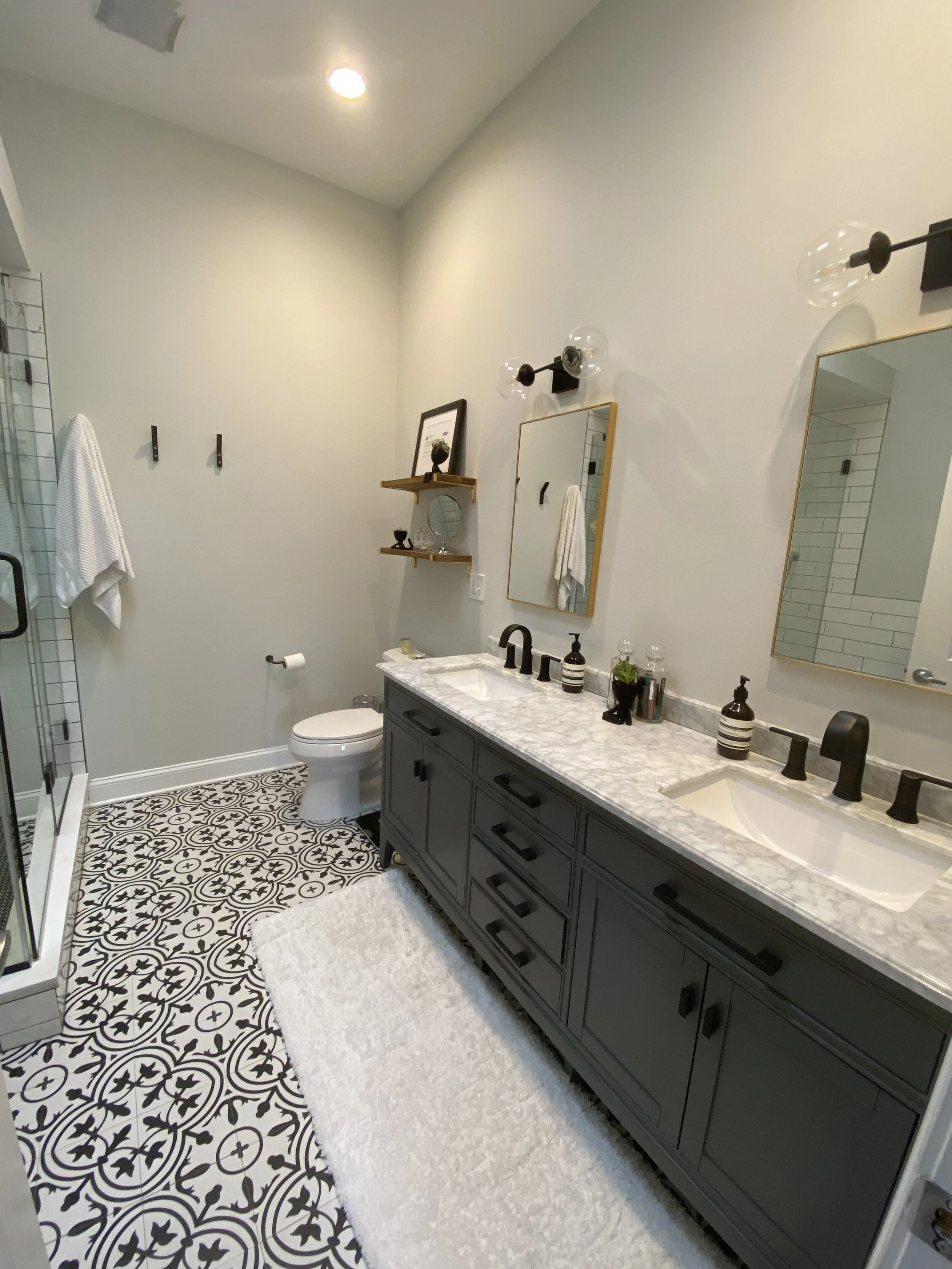
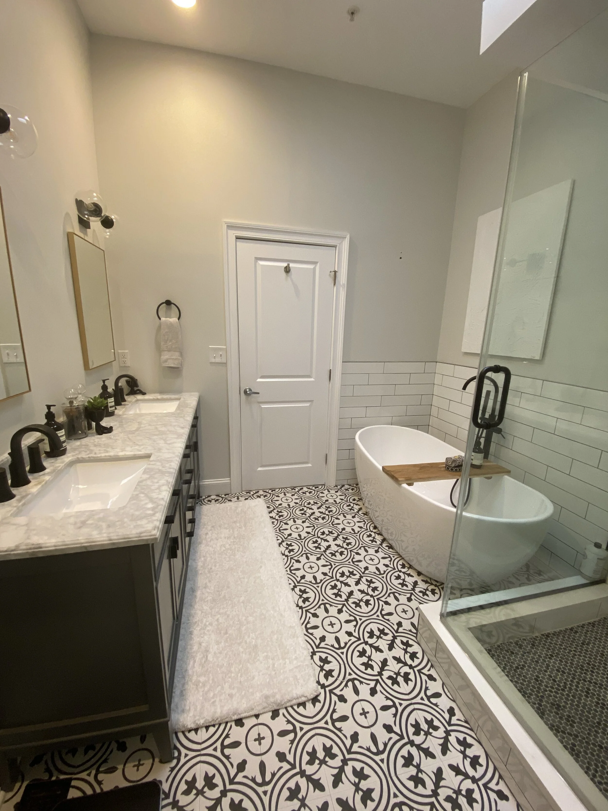
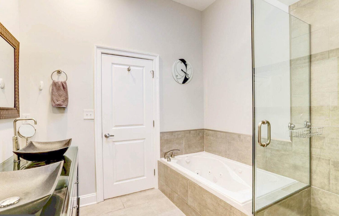
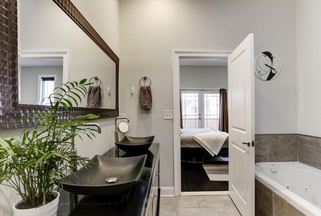
The master bath was ok but neither of them liked it and there was a lack of functionality and storage to it. We ripped everything out but left the footprint the same. Got rid of the raised sinks which are not ideal in most situations, replaced the old, worn, vanity that only had two large drawers with a piece from Home Depot with tons of storage and smaller drawers to keep them organized. We replaced the large single decorative mirror with two amazing recessed medicine cabinets from CB2 in a warm brass. When we couldn’t source new hardware for the vanity to match the sink faucets that had the right spacing, the homeowner painted the hardware on the vanity herself! They came satin nickel and she painted them matte black — instantly custom! We replaced the shower glass as well with floor to ceiling glass to keep the shower nice and toasty and had matte black hardware added to match the rest of the room. We added wooden shelves from Rejuvenation with brass brackets, along with a live edge wood bath tray from CB2 to warm up the space which could, in black, white and grays, easily read as cold. It was a leap of faith to get the homeowner to trust me on the gold accents but in the end, everyone is happy with the result.
The paint in the room is Benjamin Moore Paper White. One of my go to whites. It’s white but not stark and hides scuffs better than most whites I’ve used.
Click through the photos for Before and After shots.
Photos by me and the homeowner which is why they aren’t great :)
