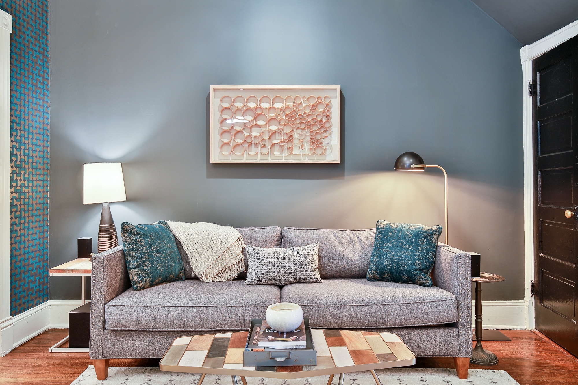
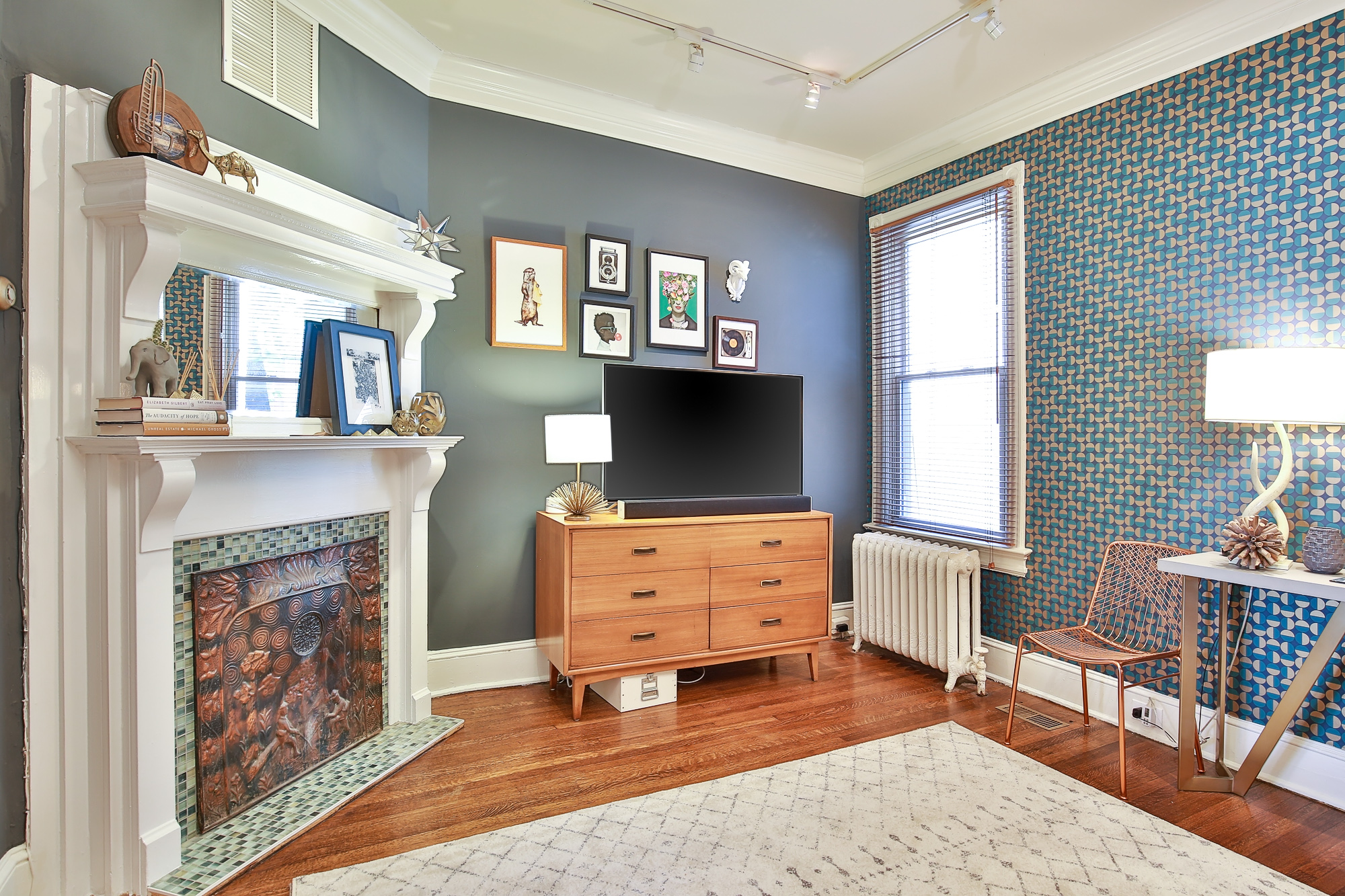
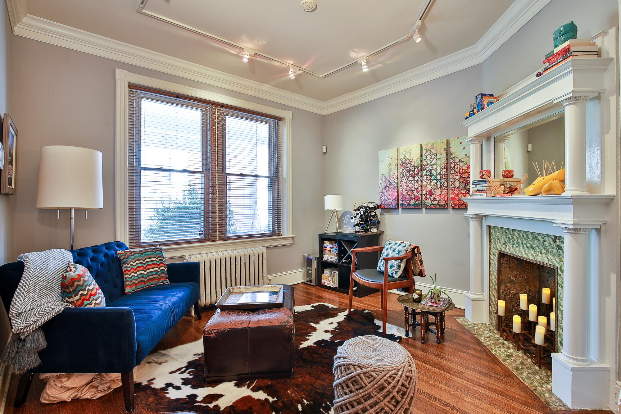
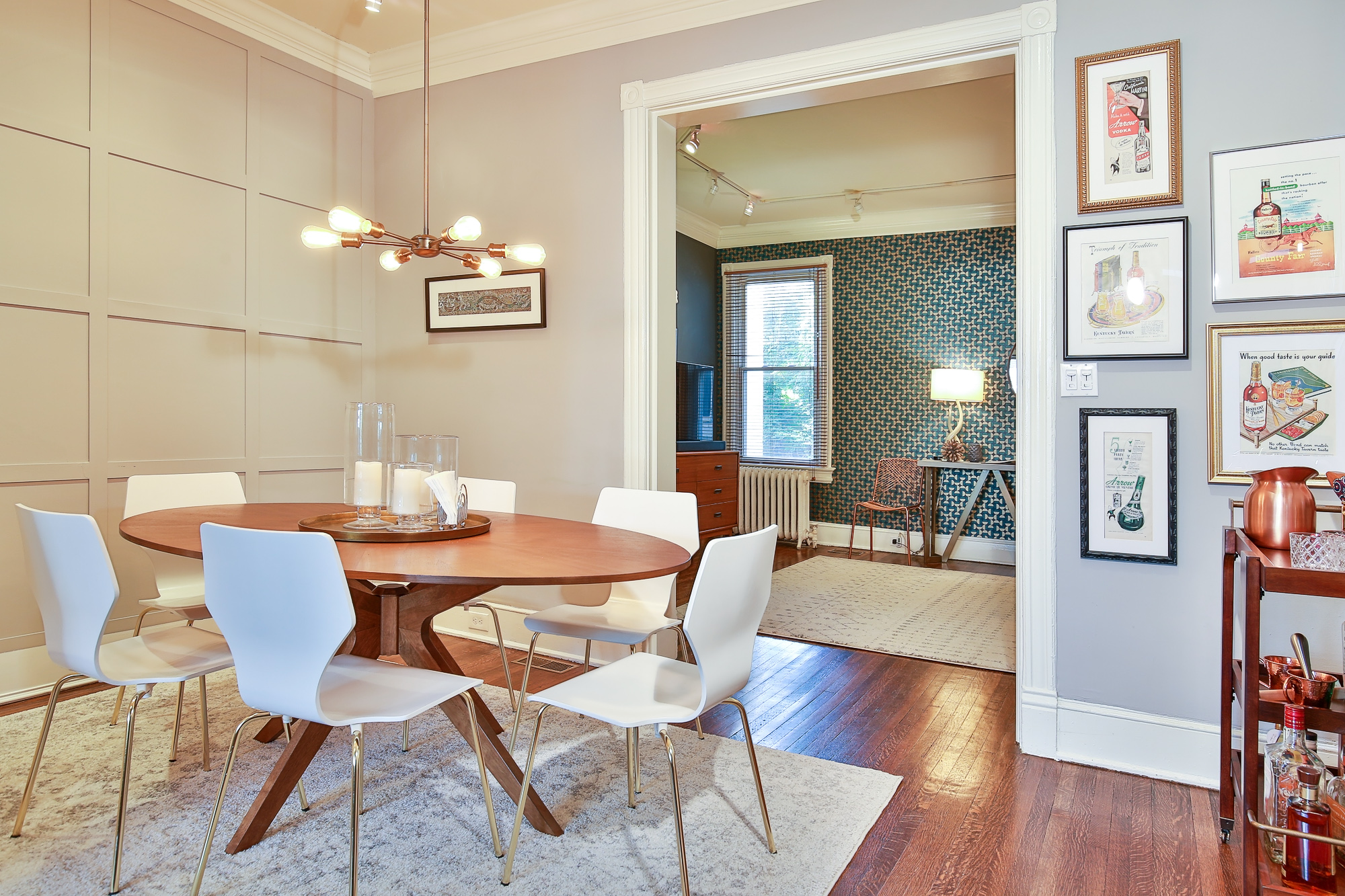
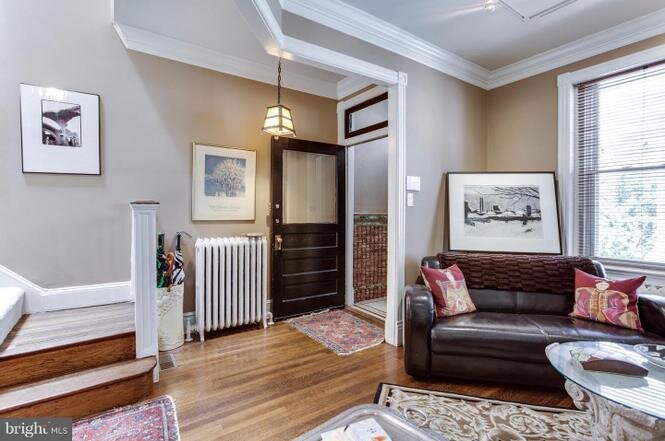
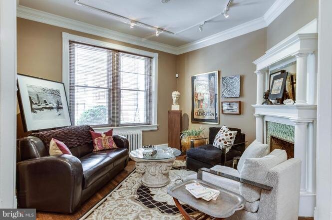
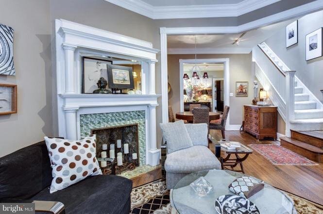
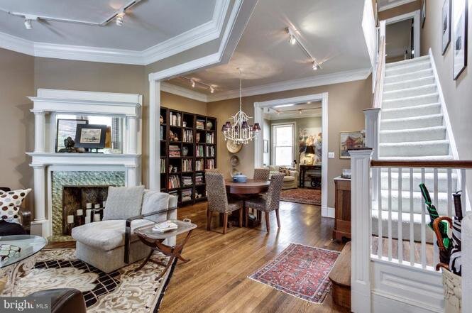
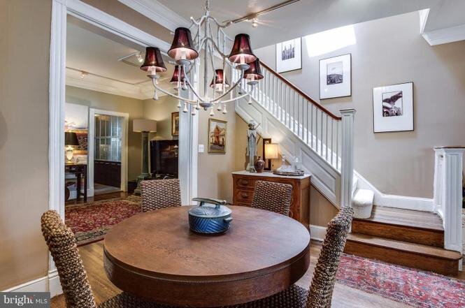
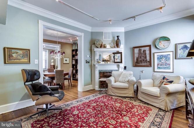
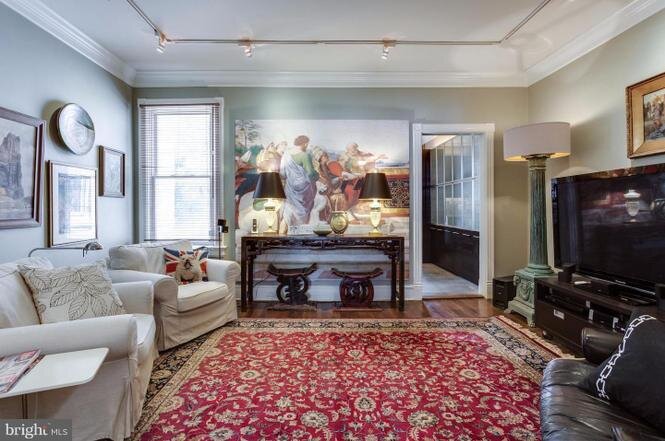
This home was lovely to start with but had some interesting challenges. To begin with, it was a middle rowhome (typical DC Wardman) and had no windows to the West or East. That left some rooms fairly dark. Rather than fight it, I used a saturated color Benjamin Moore’s Flint in the “TV Room” that coordinated with the reflective bronze, navy, and teal circular wallpaper, Vertigo from Boråstapeter Wallpapers. Paired with a white area rug to brighten the space and gold, bronze, and wood accents, kept this room comfortable and bright and anchored the custom nailhead sofa and vintage dresser used as a TV stand.
The dining room needed something to add interest in that room so we cladded the walls with board and battan to give it depth.
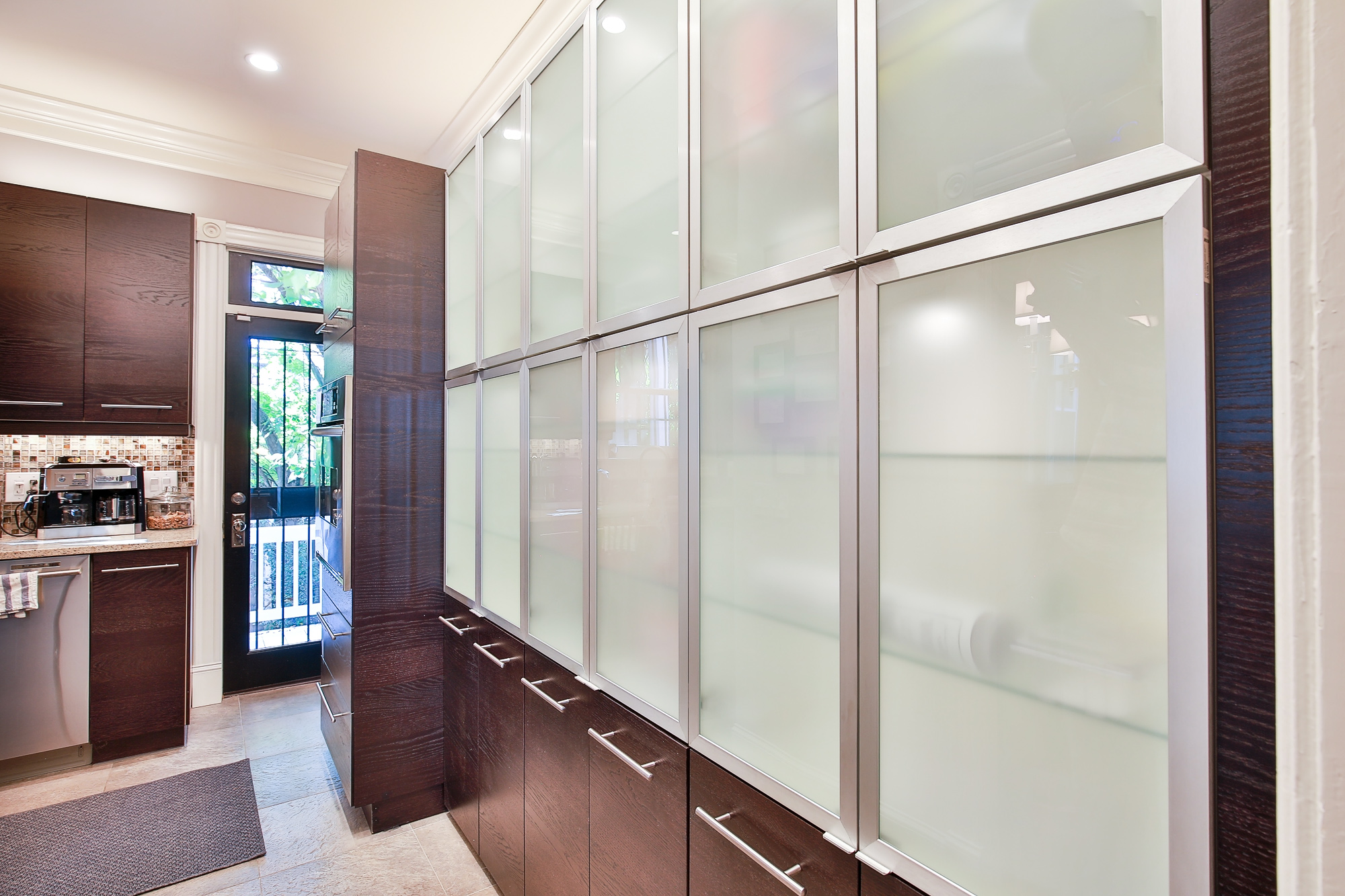
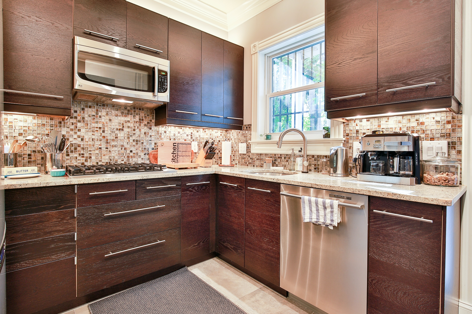
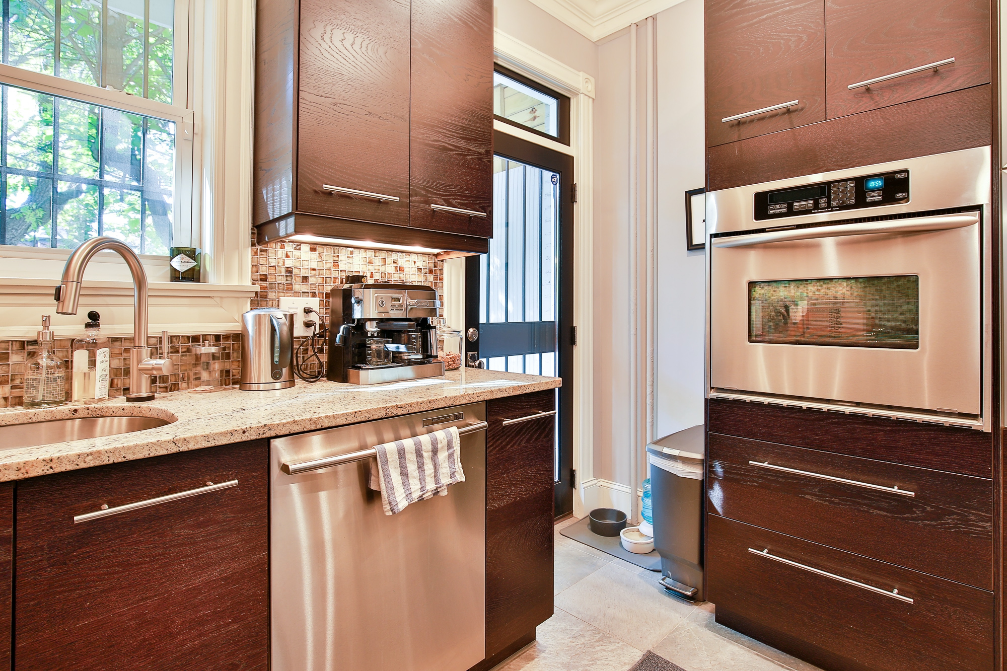
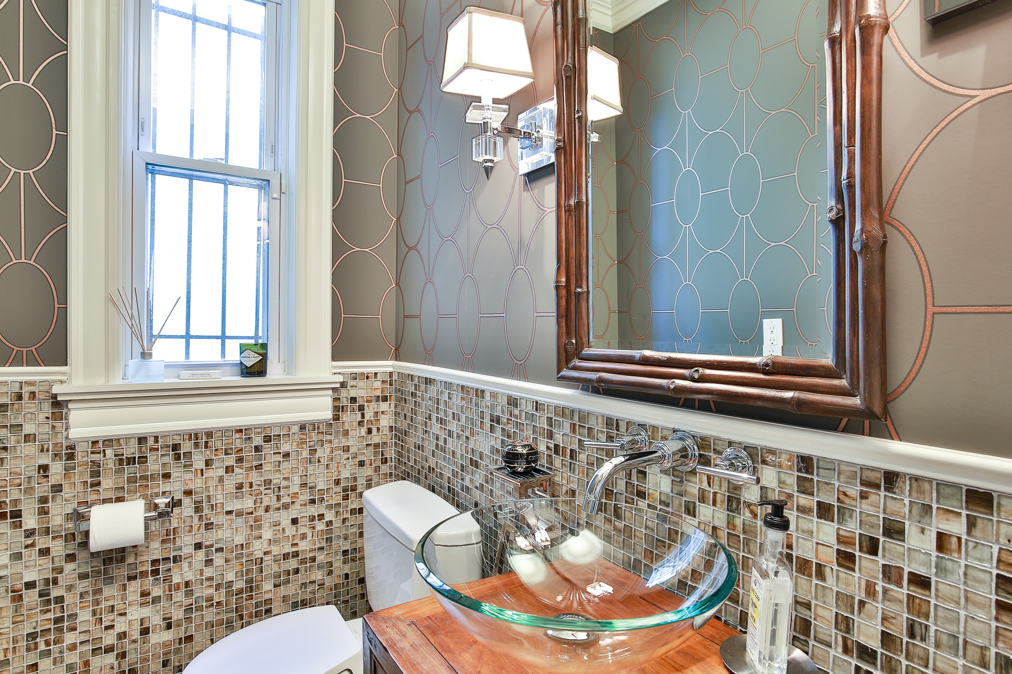
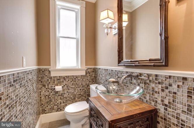
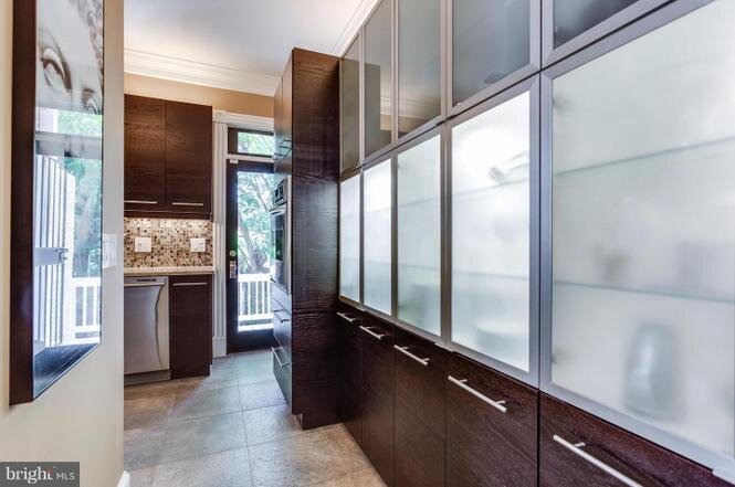
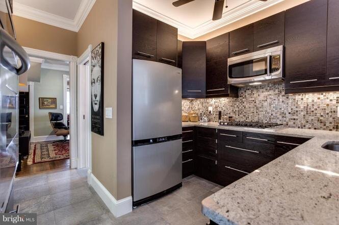
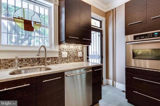
The kitchen had good bones but needed to be brighter so a fresh coat of paint was all that was done in that room in addition to some decorating. The half bath wasn’t high on the priority list so instead of ripping out everything which was my first instinct, I thought we’d distract from the things I didn’t like with a great coordinating wallpaper from Cole & Sons, Riviera in Charcoal/Bronze. Both the kitchen and the half bath will be part of a Phase 2 sometime down the road.
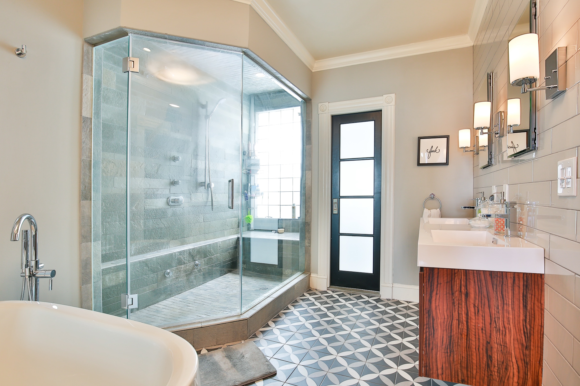
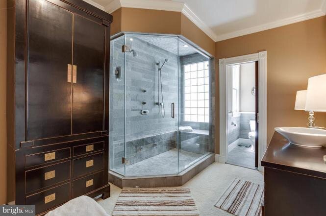
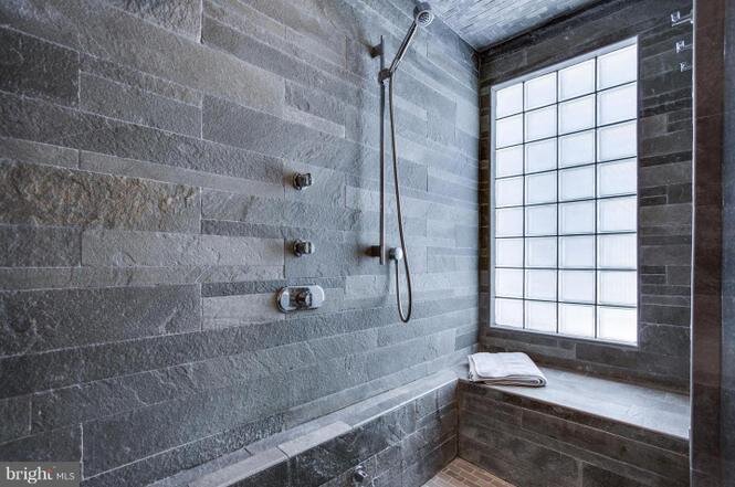
Other quirks of the home included a huge steam shower in the master bathroom, but no tub or double vanity, and LOTS of white carpet throughout the entire second floor and stairs. We ripped up the carpet and when we saw the condition of the subfloor in the bathroom (who knew carpet and bathrooms don’t mix?), realized that we’d need to replace that due to mold and rot. While we had the subfloor opened, we ran plumbing and added a large luxurious soaking tub. The rich wood double vanity works to bring a warmth to the space and the grey tile wall served to both balance the grey slate shower that was already there, and provide protection to the walls behind the sink. With any bathroom renovation I do, storage is paramount, and hiding all the bathroom accoutrements so two medicine cabinets were added as well as additional electrical outlets under the sinks for all those unsightly things that you need in a bathroom but don’t want on the counters.
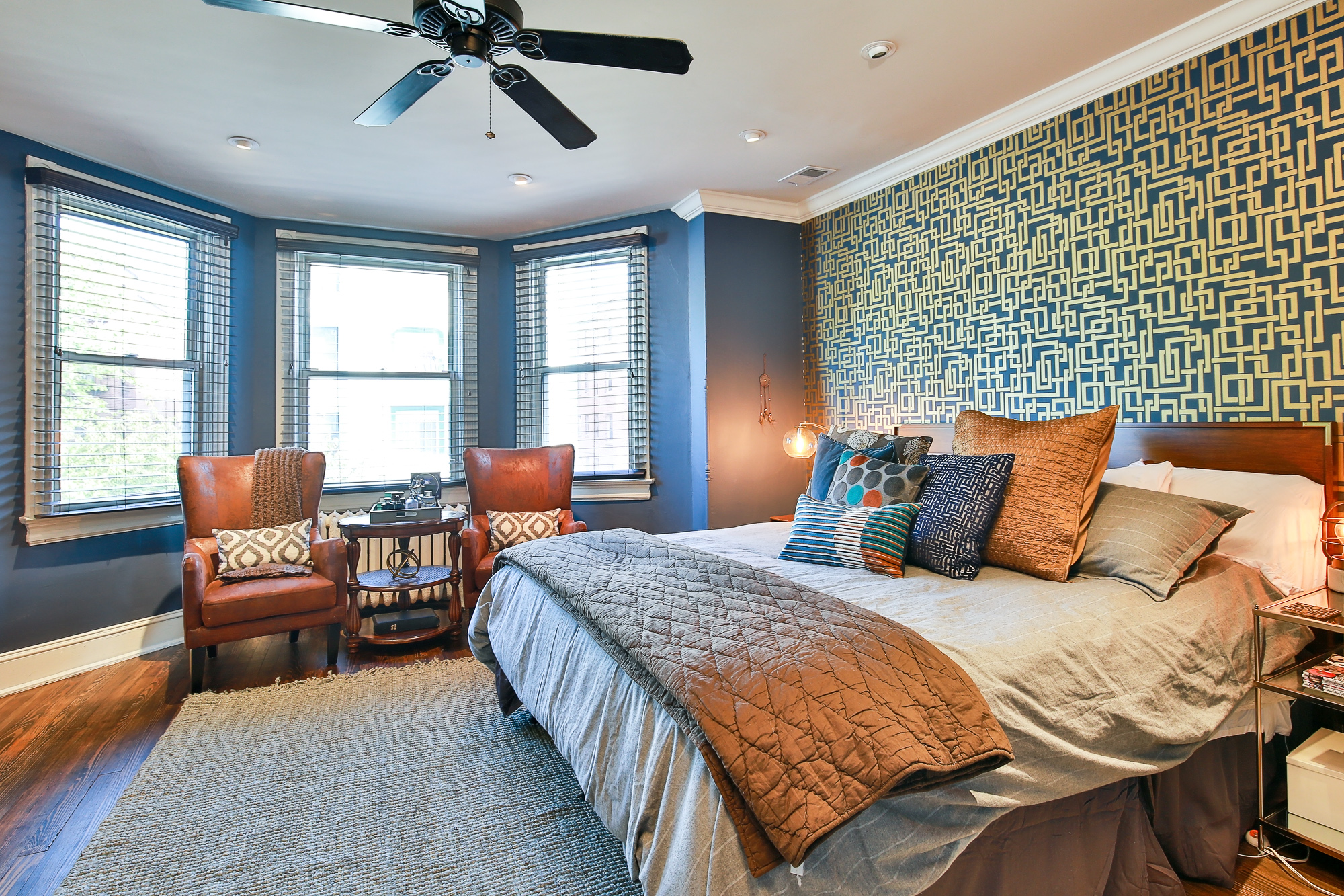
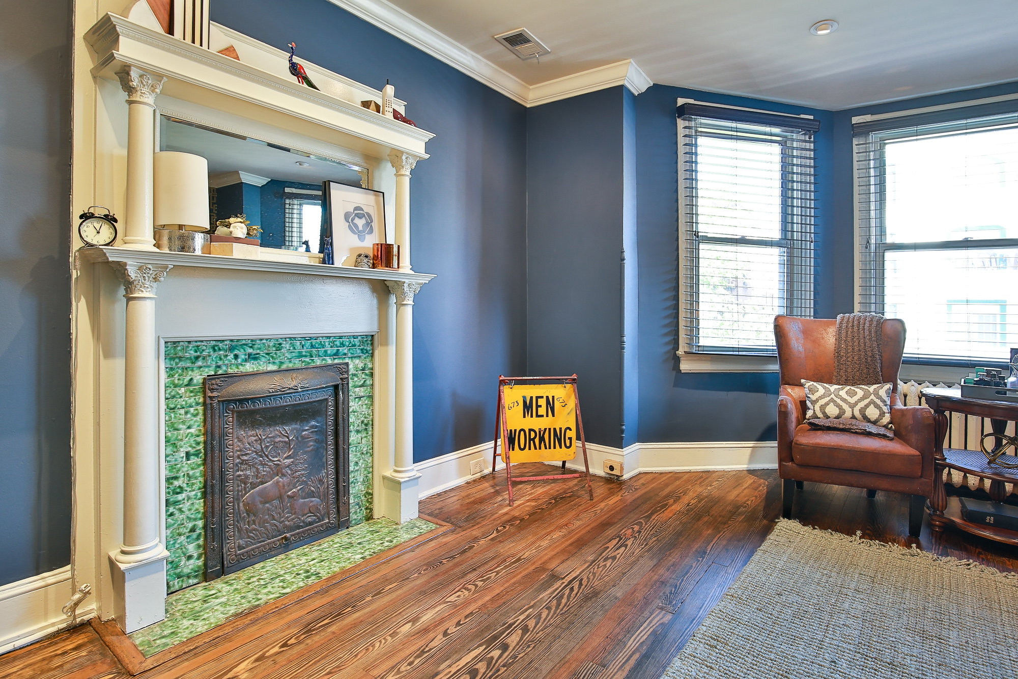
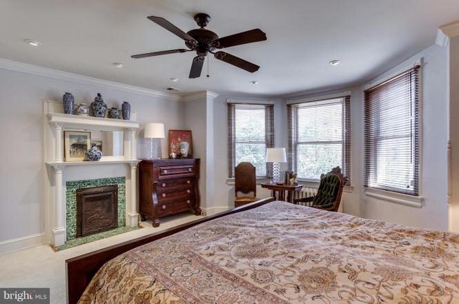
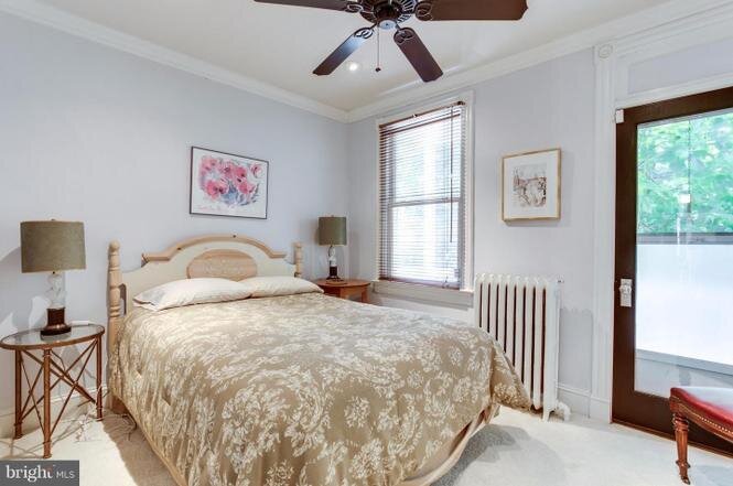
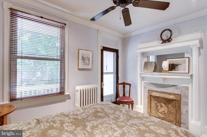
The master bedroom was massive and making it feel cozy was a challenge. I found this incredible wallpaper from Farrow and Ball called Enigma which gave the room a focal point on the bed wall. I had the color on the back of the paper matched and painted it a custom color throughout the room. The darker blue color gave this room a very comforting feeling and made some of the great touches like the plaster work around the bay window pop.
Photos by: Nathan Hirsch Photography
Before photos:
